


Hi everyone,
today we are going to learn flexbox
#So what is flexbox?
Flexbox, also known as Flex Box Layout, is a layout property in CSS that makes it easy to create flexible, responsive layouts and align elements within a container. With Flexbox, you can control the size, position, and spacing of elements within a container, regardless of their size or order in the HTML document.
One of the main advantages of Flexbox is that it allows you to create layouts that are easily scalable and adaptable to different screen sizes. This makes it ideal for creating responsive designs that work well on a wide range of devices, from small smartphones to large desktop screens.
The following are some of the main properties of Flexbox CSS:
display: The display property is used to create a flex container. It can be set to "flex" or "inline-flex".example :
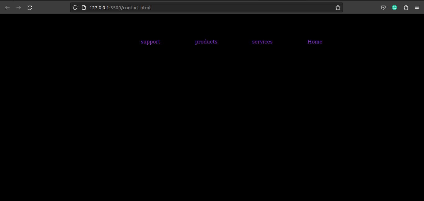
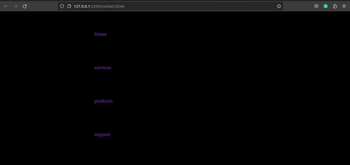
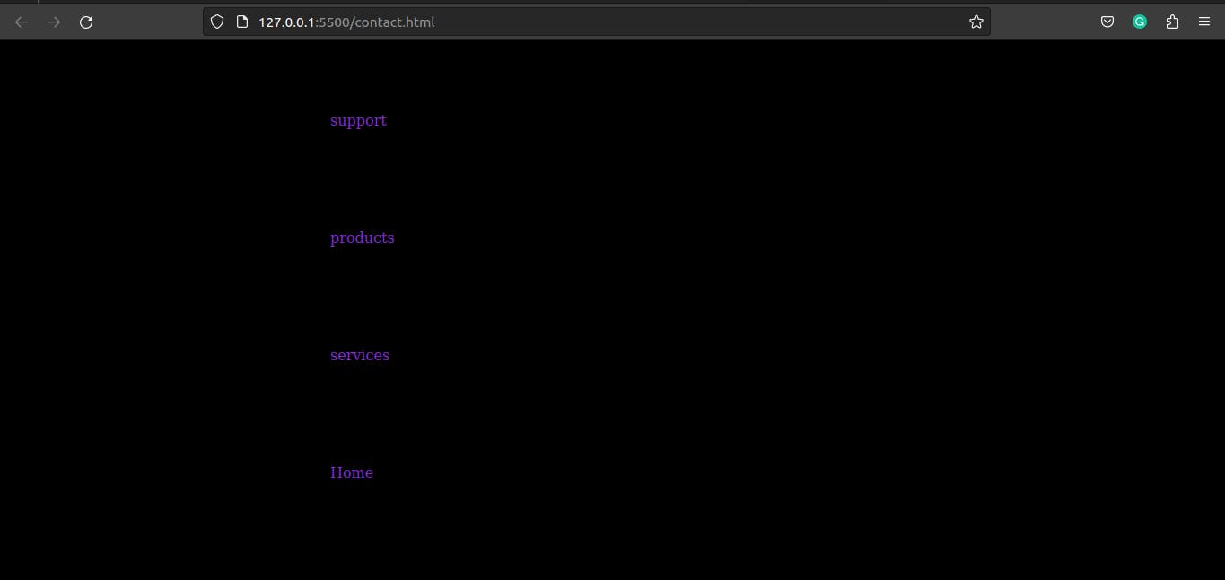
display:flex;flex-direction: The flex-direction property controls the direction in which elements are laid out within the container. The default value is "row", but it can also be set to "column", "row-reverse", or "column-reverse".let's see the example below :
row:<div class="flexbox"> <ul> <li>Home</li> <li>Services</li> <li>Product</li> <li>Support</li> </ul> </div>* { background-color: black; } .flexbox { margin: 5rem 25rem; } .flexbox ul { display: flex; color: blueviolet; list-style: none; gap: 5rem; }Output :

row-reverse:<div class="flexbox"> <ul> <li>Home</li> <li>Services</li> <li>Product</li> <li>Support</li> </ul> </div>* { background-color: black; } .flexbox { margin: 5rem 25rem; } .flexbox ul { display: flex; flex-direction: row-reverse; color: blueviolet; list-style: none; gap: 5rem; }Output :
 <div class="flexbox">
     <ul>
       <li>Home</li>
       <li>Services</li>
       <li>Product</li>
       <li>Support</li>
     </ul>
   </div>
* { background-color: black; } .flexbox { margin: 5rem 5rem; } .flexbox ul { display: flex; flex-direction: column; color: blueviolet; list-style: none; gap: 5rem; }Output :
 <div class="flexbox">
     <ul>
       <li>Home</li>
       <li>Services</li>
       <li>Product</li>
       <li>Support</li>
     </ul>
   </div>
* { background-color: black; } .flexbox { margin: 5rem 5rem; } .flexbox ul { display: flex; flex-direction: column-reverse; color: blueviolet; list-style: none; gap: 5rem; }Output :
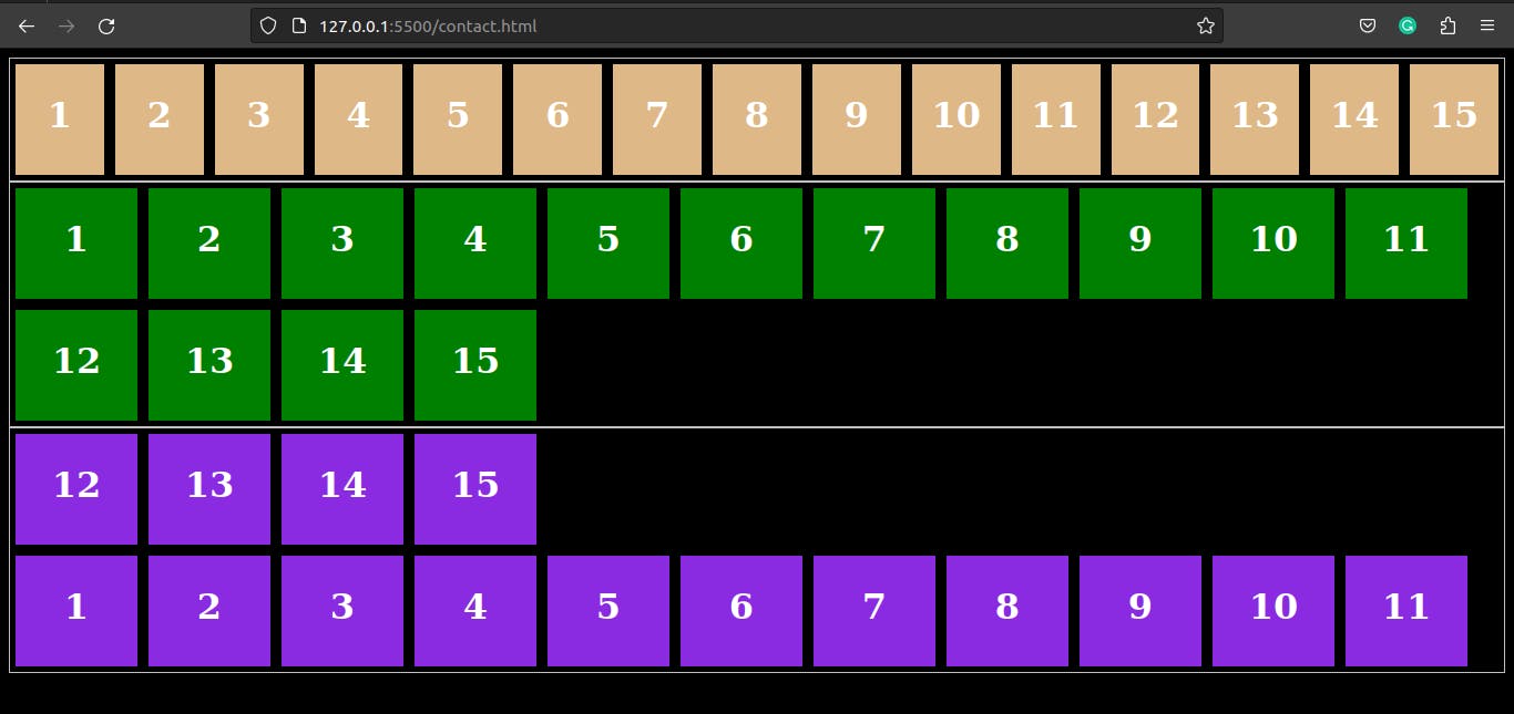
flex-wrap: The flex-wrap property controls whether elements should wrap to a new row or column when they reach the end of the container. The default value is "nowrap", but it can also be set to "wrap" or "wrap-reverse".Example :
 <!DOCTYPE html>
 <html lang="en">
 <head>
   <meta charset="UTF-8">
   <meta http-equiv="X-UA-Compatible" content="IE=edge">
   <meta name="viewport" content="width=device-width, initial-scale=1.0">
   <title>Document</title>
   <link rel="stylesheet" href="style.css">
 </head>
 <body>
   <div class="flexbox">
     <ul class="flex-container nowrap">
       <li class="flex-item">1</li>
       <li class="flex-item">2</li>
       <li class="flex-item">3</li>
       <li class="flex-item">4</li>
       <li class="flex-item">5</li>
       <li class="flex-item">6</li>
       <li class="flex-item">7</li>
       <li class="flex-item">8</li>
       <li class="flex-item">9</li>
       <li class="flex-item">10</li>
       <li class="flex-item">11</li>
       <li class="flex-item">12</li>
       <li class="flex-item">13</li>
       <li class="flex-item">14</li>
       <li class="flex-item">15</li>
     </ul>
     <ul class="flex-container wrap">
       <li class="flex-item">1</li>
       <li class="flex-item">2</li>
       <li class="flex-item">3</li>
       <li class="flex-item">4</li>
       <li class="flex-item">5</li>
       <li class="flex-item">6</li>
       <li class="flex-item">7</li>
       <li class="flex-item">8</li>
       <li class="flex-item">9</li>
       <li class="flex-item">10</li>
       <li class="flex-item">11</li>
       <li class="flex-item">12</li>
       <li class="flex-item">13</li>
       <li class="flex-item">14</li>
       <li class="flex-item">15</li>
     </ul>
     <ul class="flex-container wrap-reverse">
       <li class="flex-item">1</li>
       <li class="flex-item">2</li>
       <li class="flex-item">3</li>
       <li class="flex-item">4</li>
       <li class="flex-item">5</li>
       <li class="flex-item">6</li>
       <li class="flex-item">7</li>
       <li class="flex-item">8</li>
       <li class="flex-item">9</li>
       <li class="flex-item">10</li>
       <li class="flex-item">11</li>
       <li class="flex-item">12</li>
       <li class="flex-item">13</li>
       <li class="flex-item">14</li>
       <li class="flex-item">15</li>
     </ul>
   </div>
 </body>
 </html>
* { background-color: black; } .flex-container { padding: 0; margin: 0; list-style: none; border: 1px solid silver; display: flex; } .nowrap { flex-wrap: nowrap; /* no wrap */ } .wrap { flex-wrap: wrap; /* wrap the element inside container 'green-one'*/ } .wrap li { background: green; } .wrap-reverse { flex-wrap: wrap-reverse;/* reverse the element inside container that 'voilet-one'*/ } .wrap-reverse li { background: blueviolet; } .flex-item { background: burlywood; padding: 5px; width: 100px; height: 90px; margin: 5px; line-height: 80px; color: white; font-weight: bold; font-size: 2em; text-align: center; }Output :
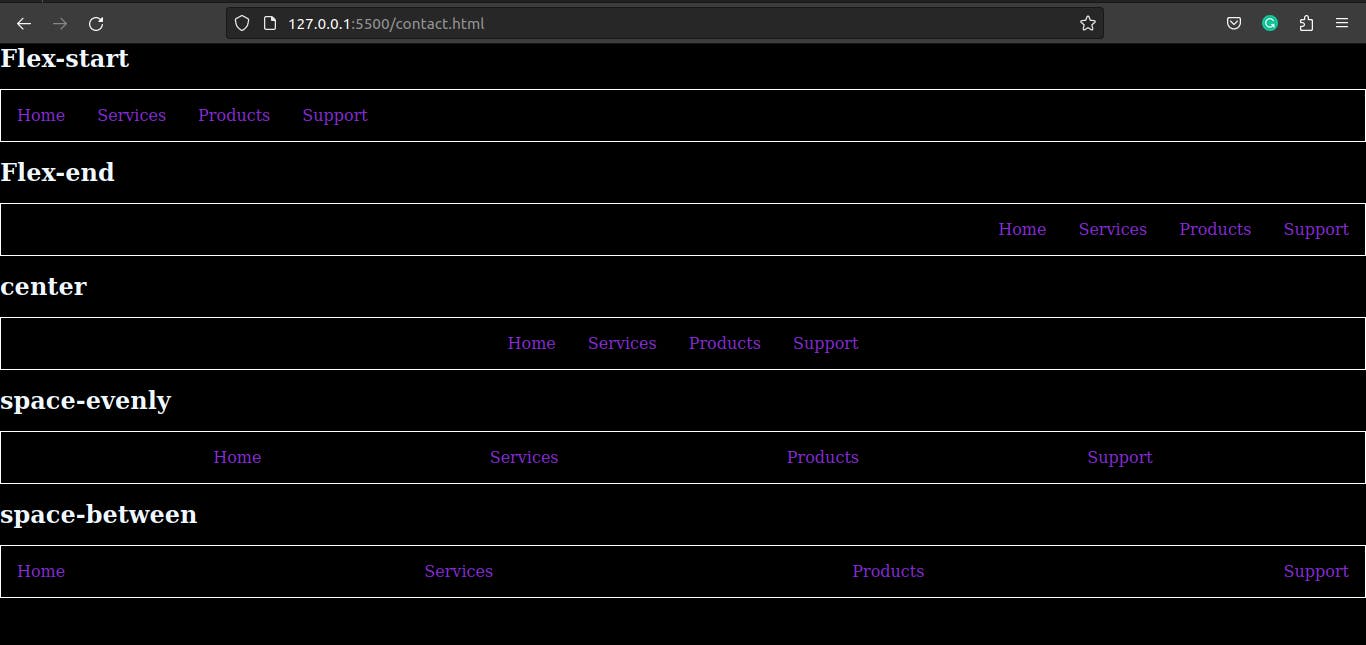
justify-content: The justify-content property controls how elements are aligned along the main axis of the container. The default value is "flex-start", but it can also be set to "center", "flex-end", "space-between", "space-around", or "space-evenly".Example:
 <div class="flexbox">
     <h5 class="start">Flex-start</h5>
     <ul class="list-item">
       <li>Home</li>
       <li>Services</li>
       <li>Products</li>
       <li>Support</li>
     </ul>
     <h5 class="end">Flex-end</h5>
     <ul class="list-item-2">
       <li>Home</li>
       <li>Services</li>
       <li>Products</li>
       <li>Support</li>
     </ul>
     <h5 class="center">center</h5>
     <ul class="list-item-3">
       <li>Home</li>
       <li>Services</li>
       <li>Products</li>
       <li>Support</li>
     </ul>
     <h5 class="space-evenly">space-evenly</h5>
     <ul class="list-item-4">
       <li>Home</li>
       <li>Services</li>
       <li>Products</li>
       <li>Support</li>
     </ul>
     <h5 class="space-between">space-between</h5>
     <ul class="list-item-5">
       <li>Home</li>
       <li>Services</li>
       <li>Products</li>
       <li>Support</li>
     </ul>
   </div>
* { margin: 0; padding: 0; background-color: black; } .flexbox .start { color: aliceblue; font-size: 1.5em; margin-bottom: 1rem; } .flexbox .end { color: aliceblue; font-size: 1.5em; margin-bottom: 1rem; } .flexbox .center { color: aliceblue; font-size: 1.5em; margin-bottom: 1rem; } .flexbox .space-evenly { color: aliceblue; font-size: 1.5em; margin-bottom: 1rem; } .flexbox .space-between { color: aliceblue; font-size: 1.5em; margin-bottom: 1rem; } .flexbox .list-item { display: flex; color: blueviolet; list-style: none; gap: 2rem; border: 1px solid white; margin-bottom: 1rem; padding: 1rem 1rem; } .flexbox > .list-item-2 { display: flex; justify-content: flex-end; color: blueviolet; list-style: none; gap: 2rem; border: 1px solid white; margin-bottom: 1rem; padding: 1rem 1rem; } .flexbox >.list-item-3 { display: flex; justify-content:center ; color: blueviolet; list-style: none; gap: 2rem; border: 1px solid white; margin-bottom: 1rem; padding: 1rem 1rem; } .flexbox >.list-item-4 { display: flex; justify-content: space-evenly; color: blueviolet; list-style: none; gap: 2rem; border: 1px solid white; margin-bottom: 1rem; padding: 1rem 1rem; } .flexbox >.list-item-5 { display: flex; justify-content: space-between; color: blueviolet; list-style: none; gap: 2rem; border: 1px solid white; margin-bottom: 1rem; padding: 1rem 1rem; }Output :
align-items: The align-items property controls how elements are aligned along the cross-axis of the container. The default value is "stretch", but it can also be set to "flex-start", "center", "flex-end", "baseline", or "stretch".example :
  <div class="flex-container">
     <ul class="flex-container">
       <li class="flex-item flex-start">Home</li>
       <li class="flex-item flex-end ">Services</li>
       <li class="flex-item center">Products</li>
       <li class="flex-item baseline">Support</li>
       <li class="flex-item stretch">about</li>
     </ul>
   </div>
* { background: black; } .flex-container { padding: 0; margin: 0; list-style: none; height: 200px; display: flex; } .flex-start { align-self: flex-start; } .flex-end { align-self: flex-end; } .center { align-self: center; } .baseline { align-self: baseline; } .stretch { align-self: stretch; } .flex-item { background: green; padding: 5px; width: 100px; margin: 5px; line-height: 100px; color: white; font-size: 1rem; text-align: center; }Output :

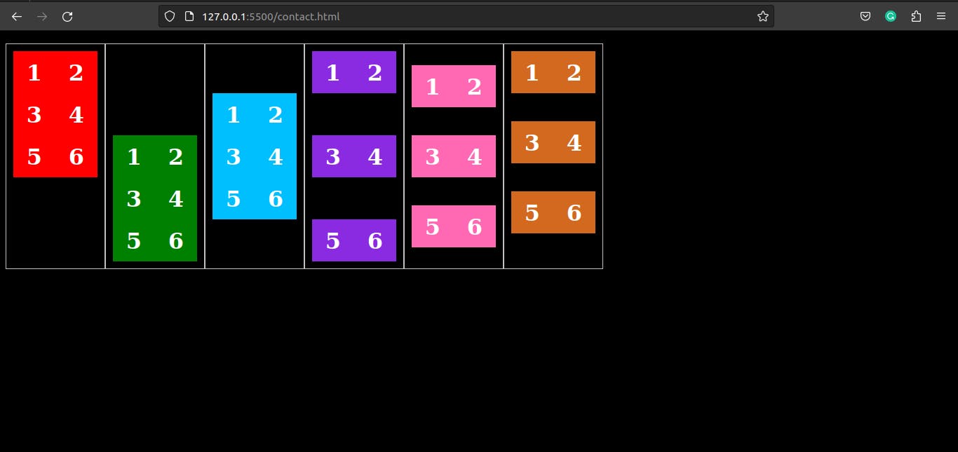
align-content: The align-content property controls how elements are aligned along the cross-axis of the container when there is extra space. It only works when the flex-wrap is set to wrap.Example :
   <div class="flex-box">
     <ul class="flex-container flex-start">
       <li class="flex-item">1</li>
       <li class="flex-item">2</li>
       <li class="flex-item">3</li>
       <li class="flex-item">4</li>
       <li class="flex-item">5</li>
       <li class="flex-item">6</li>
     </ul>
     <ul class="flex-container flex-end">
       <li class="flex-item">1</li>
       <li class="flex-item">2</li>
       <li class="flex-item">3</li>
       <li class="flex-item">4</li>
       <li class="flex-item">5</li>
       <li class="flex-item">6</li>
     </ul>
     <ul class="flex-container center">
       <li class="flex-item">1</li>
       <li class="flex-item">2</li>
       <li class="flex-item">3</li>
       <li class="flex-item">4</li>
       <li class="flex-item">5</li>
       <li class="flex-item">6</li>
     </ul>
     <ul class="flex-container space-between">
       <li class="flex-item">1</li>
       <li class="flex-item">2</li>
       <li class="flex-item">3</li>
       <li class="flex-item">4</li>
       <li class="flex-item">5</li>
       <li class="flex-item">6</li>
     </ul>
     <ul class="flex-container space-around">
       <li class="flex-item">1</li>
       <li class="flex-item">2</li>
       <li class="flex-item">3</li>
       <li class="flex-item">4</li>
       <li class="flex-item">5</li>
       <li class="flex-item">6</li>
     </ul>
     <ul class="flex-container stretch">
       <li class="flex-item">1</li>
       <li class="flex-item">2</li>
       <li class="flex-item">3</li>
       <li class="flex-item">4</li>
       <li class="flex-item">5</li>
       <li class="flex-item">6</li>
     </ul>
   </div>
*{ background-color: black;} .flex-container { padding: 0; margin: 0; list-style: none; float: left; width: 120px; height: 300px; padding: 10px; border: 1px solid silver; margin-top: 10px; display: flex; flex-flow: row wrap; } .flex-start { -webkit-align-content: flex-start; align-content: flex-start; } .flex-end { -webkit-align-content: flex-end; align-content: flex-end; } .flex-end li { background: green; } .center { align-content: center; } .center li { background: deepskyblue; } .space-between { align-content: space-between; } .space-between li { background: blueviolet; } .space-around { align-content: space-around; } .space-around li { background: hotpink; } .stretch { align-content: stretch; } .stretch li { background: chocolate; } .flex-item { background: red; padding: 5px; width: 50px; height: 50px; line-height: 50px; color: white; font-weight: bold; font-size: 2rem; text-align: center; }Output :
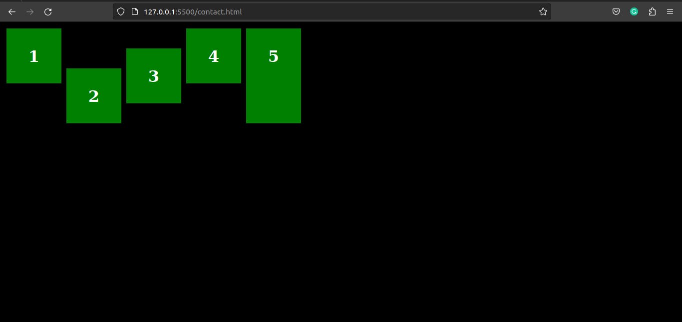
align-self: The align-self property controls how an individual element is aligned along the cross-axis of the container. It overrides the align-items property for the element it's applied to.Example :
<div class="flex-box"> <ul class="flex-container"> <li class="flex-item flex-start">1</li> <li class="flex-item flex-end">2</li> <li class="flex-item center">3</li> <li class="flex-item baseline">4</li> <li class="flex-item stretch">5</li> </ul> </div>*{background-color: black;} .flex-container { padding: 0; margin: 0; list-style: none; height: 200px; display: flex; } .flex-start { align-self: flex-start; } .flex-end { align-self: flex-end; } .center { align-self: center; } .baseline { align-self: baseline; } .stretch { align-self: stretch; } .flex-item { background: green; padding: 5px; width: 100px; margin: 5px; line-height: 100px; color: white; font-weight: bold; font-size: 2rem; text-align: center; }Output :
flex: The flex shorthand property is used to set the flex-grow, flex-shrink, and flex-basis properties all at once.<div class="container"> <div class="item item-1">Item 1</div> <div class="item item-2">Item 2</div> <div class="item item-3">Item 3</div> </div>flex-grow: The flex-grow property controls how much an element should grow relative to the other elements in the container. It controls the proportion of free space an element should take.Example:
.container { display: flex; } .item { flex-grow: 1; /* items will grow to fill the available space */ }flex-shrink: The flex-shrink property controls how much an element should shrink relative to the other elements in the container. It controls the proportion of overflow an element should take.Example:
.container { display: flex; } .item { flex-shrink: 1; /* items will shrink to fit the container if needed */ }flex-basis: The flex-basis property sets the initial size of an element before the remaining space is distributed. It can be set to a length, percentage, or the keyword "auto"..container { display: flex; } .item { flex-basis: 150px; /* items will have a starting width of 150px */ }
These are some of the main properties of Flexbox CSS, but there are many more that you can use to control the size, position, and spacing of elements within a container. It is important to note that browser support for flexbox properties may vary, so it is always a good idea to check for browser compatibility before using them in projects.