

Hi Everyone,
.
.
What is grid layout in CSS ?
CSS Grid Layout is a two-dimensional layout system for web pages. It allows developers to easily create complex and responsive grid-based layouts using a set of CSS grid properties.
To create a grid layout, you first need to define a container element and set its display property to "grid". Then, you can place the grid items inside this container element. Here is an example of a simple grid layout:
<div class="container">
  <div class="item">1</div>
  <div class="item">2</div>
  <div class="item">3</div>
  <div class="item">4</div>
  <div class="item">5</div>
</div>
.container {
  display: grid;
  grid-template-columns: repeat(3, 1fr);
  grid-template-rows: repeat(2, 100px);
  grid-gap: 10px;
}
.item {
  border: 2px solid silver;
  text-align: center;
  background-color: gold;
}
Output :
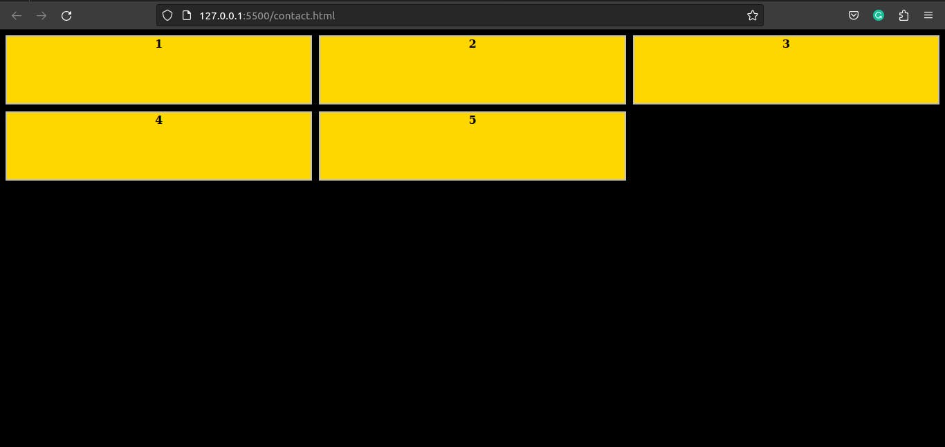
In the above example, the container element has a class of "container" and the grid items have a class of "item". The grid-template-columns property is set to repeat 3 columns with a fraction unit of 1fr, this means that the grid will have 3 equal columns. The grid-template-rows property is set to repeat 2 rows with a fixed height of 100px, this means that the grid will have 2 rows with a height of 100px. The grid-gap property is set to 10px, which creates a gap of 10 pixels between the columns and rows in the grid.
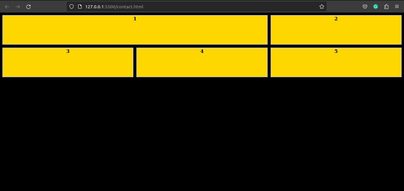
You can also use the grid-column and grid-row properties to place grid items in specific positions within the grid. For example, to place an item in the first and second column of the first row, you can use the following CSS:
.item:nth-child(1) {
  grid-column: 1 / 3;
  grid-row: 1;
}
Output :
You can also use the grid-template-areas property to define a grid template using named areas, which can be referenced by the grid-area property of grid items.
.container {
  display: grid;
  grid-template-columns: repeat(3, 1fr);
  grid-template-rows: repeat(2, 100px);
  grid-template-areas:
    ". header ."
    ". main .";
}
.header {
  grid-area: header;
}
.main {
  grid-area: main;
}
In the above example, we defined two named areas, "header" and "main" and assigned them to the specific grid items using the grid-area property.
In addition to these properties, there are several other properties available in CSS Grid Layout that can be used to customize and control the layout of the grid, such as justify-content, align-content, justify-items, and align-items. With these properties and the many others provided, CSS Grid Layout is a powerful tool that can be used to create a wide range of grid-based layouts for web pages.
The grid-template-columns and grid-template-rows properties define the number of columns and rows in the grid, respectively. These properties can take a variety of values such as fixed pixel values, percentages, or the keyword "auto". The grid-column-gap and grid-row-gap properties define the space between columns and rows in the grid, respectively.
CSS Grid Layout also includes several other properties for advanced layout control, such as grid-area, grid-template, and grid-template-areas. These properties allow for more complex and dynamic grid layouts.
Different properties in Grid Layout :
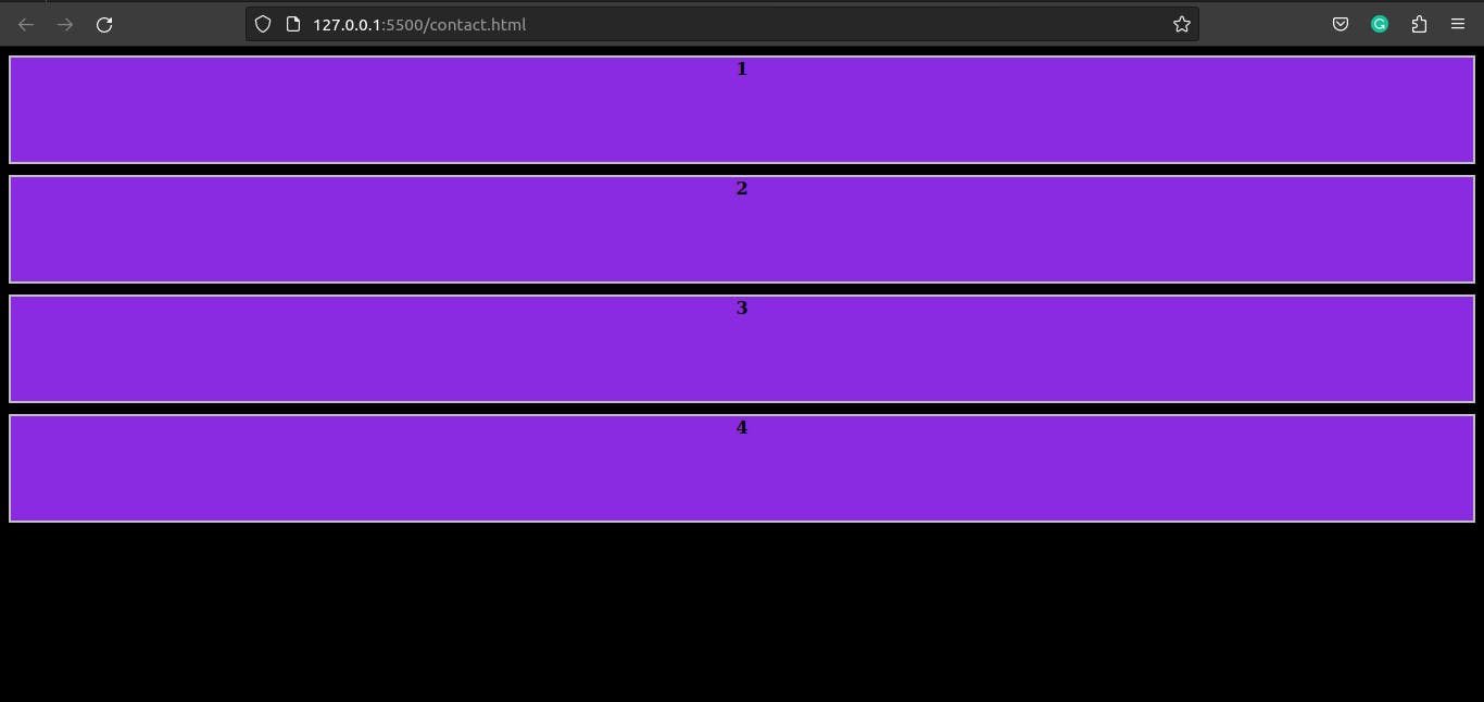
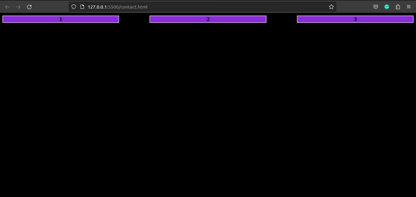
grid-template-columns: This property defines the number of columns in the grid and the width of each column. It can take a variety of values such as fixed pixel values, percentages, or the keyword "auto".example:
<div class="container"> <div class="item">1</div> <div class="item">2</div> <div class="item">3</div> <div class="item">4</div> </div>*{background-color: black;} .container { display: grid; grid-template-columns: repeat(4, 1fr); grid-gap: 10px; } .item { border: 2px solid silver; text-align: center; background-color: blueviolet; color: white; font-weight: lighter; }Output :

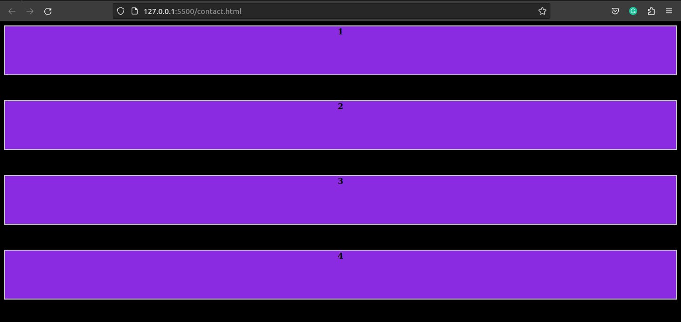
grid-template-rows: This property defines the number of rows in the grid and the height of each row. Likegrid-template-columns, it can take a variety of values such as fixed pixel values, percentages, or the keyword "auto".*{background-color: black;} .container { display: grid; grid-template-rows: repeat(4, 100px); grid-gap: 10px; } .item { border: 2px solid silver; text-align: center; background-color: blueviolet; color: black; font-weight: bold; }Output :
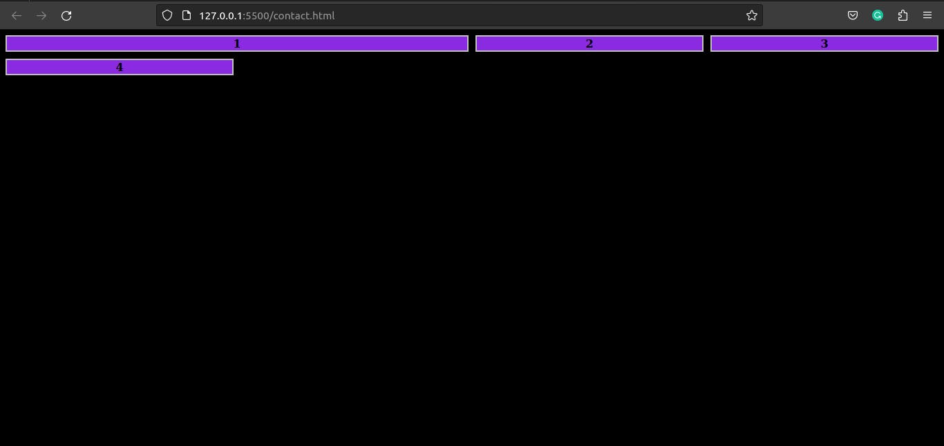
grid-column-gap: This property defines the space between columns in the grid. It can take a value in pixels, ems, or other length units.*{background-color: black;} .container { display: grid; grid-template-columns: repeat(3, 1fr); grid-column-gap: 100px; } .item { border: 2px solid silver; text-align: center; background-color: blueviolet; color: black; font-weight: bold; }Output :
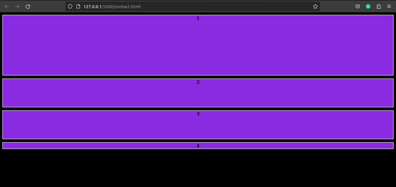
grid-row-gap: This property defines the space between rows in the grid. Likegrid-column-gap, it can take a value in pixels, ems, or other length units.*{background-color: black;} .container { display: grid; grid-template-rows: repeat(4, 100px); grid-row-gap: 50px; } .item { border: 2px solid silver; text-align: center; background-color: blueviolet; color: black; font-weight: bold; }Output :
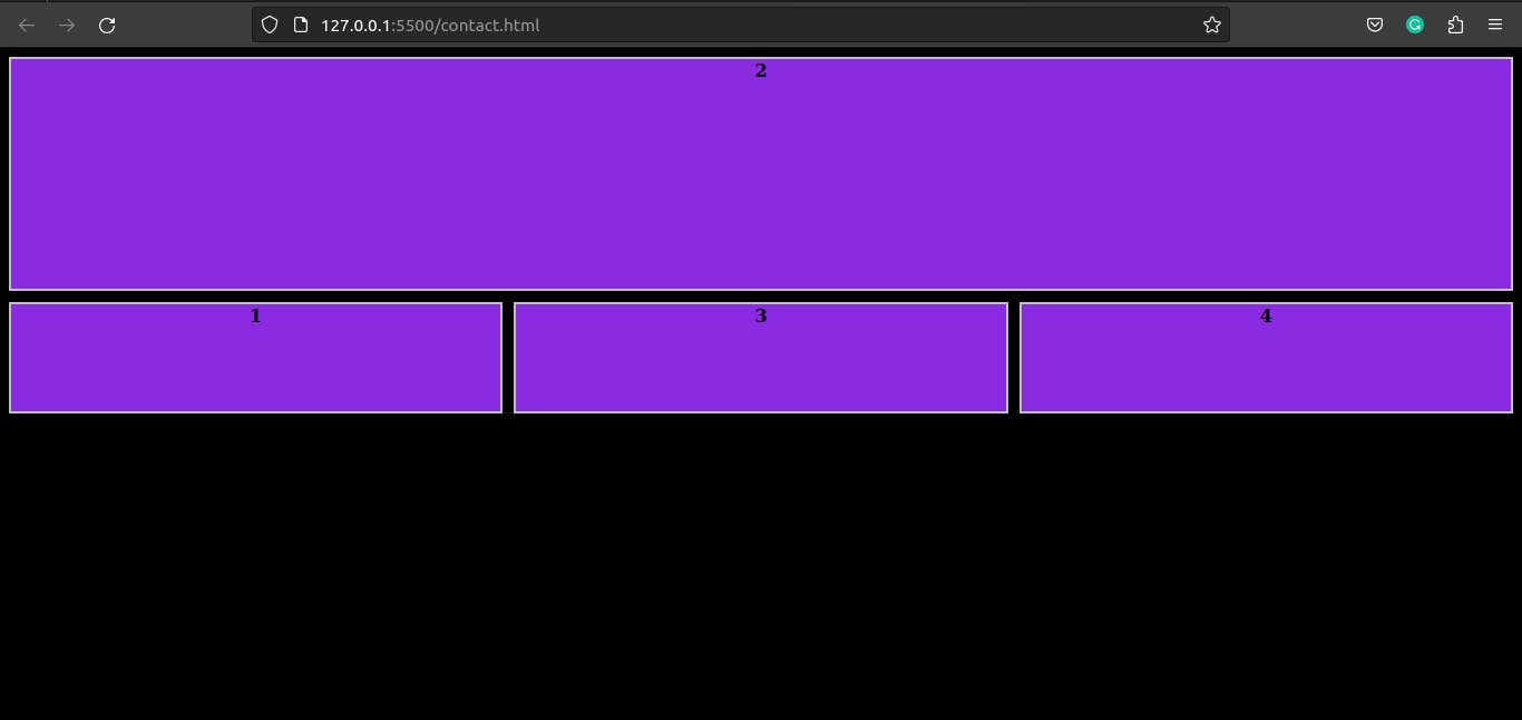
grid-column: This property specifies the starting and ending positions of a grid item along the columns. It can take a value such as "1 / 3" to place an item in the first and second column of the grid.*{background-color: black;} .container { display: grid; grid-template-columns: repeat(4, 1fr); grid-gap: 10px; } .item { border: 2px solid silver; text-align: center; background-color: blueviolet; color: black; font-weight: bold; } .item:nth-child(1) { grid-column: 1 / 3; }Output :
grid-row: This property specifies the starting and ending positions of a grid item along the rows. It can take a value such as "1 / 3" to place an item in the first and second row of the grid.*{background-color: black;} .container { display: grid; grid-template-rows: repeat(4, 100px); grid-gap: 10px; } .item { border: 2px solid silver; text-align: center; background-color: blueviolet; color: black; font-weight: bold; } .item:nth-child(1) { grid-row: 1 / 3; }Output :
grid-area: This property allows you to assign a grid item to a specific area within the grid by specifying the grid row and column it should span.*{background-color: black;} .container { display: grid; grid-template-rows: repeat(4, 100px); grid-gap: 10px; } .item { border: 2px solid silver; text-align: center; background-color: blueviolet; color: black; font-weight: bold; } .item:nth-child(2) { grid-area: 1 / 4 / 3 / 1; }Output :
grid-template: This property is a shorthand for specifying thegrid-template-columns,grid-template-rows, andgrid-template-areasproperties all at once.grid-template-areas: This property allows you to define a grid template using named areas, which can be referenced by thegrid-areaproperty of grid items.justify-content: This property aligns the grid along the horizontal axis. It can take values such as "center", "start", "end", "stretch", "space-between", and "space-around".align-content: This property aligns the grid along the vertical axis. It can take values such as "center", "start", "end", "stretch", "space-between", and "space-around".justify-items: This property aligns the grid items along the horizontal axis. It can take values such as "center", "start", "end", "stretch", "baseline", and "self-start".align-items: This property aligns the grid items along the vertical axis. It can take values such as "center", "start", "end", "stretch", "baseline", and "self-start".
This is not an exhaustive list, but covers most of the commonly used properties. Each of these properties can be used to create a wide range of grid-based layouts.
.
.
HOpe u LiKe iT.