

Hi Everyone,
.
.
Media Query :
Media query is a powerful Property in CSS that allow developers to apply different styles to a website based on the characteristics of the device or screen being used to view the site. This allows for a more optimal user experience, as different devices.
To use media queries in CSS, you first need to specify the media type and any media features that you want to target. The media type can be "all", "print", "screen", or "speech", and media features can include things like screen width, screen height, and device resolution. For example, the following media query targets screens with a minimum width of 600 pixels:
@media screen and (min-width: 600px) {
  /* styles for screens with a minimum width of 600 pixels */
}
You can also use logical operators like "and" and "not" to chain together multiple media features, as well as use "only" to target specific types of devices. For example, the following media query targets print media that is in landscape orientation:
@media print and (orientation: landscape) {
  /* styles for print media in landscape orientation */
}
It's also possible to use media queries to hide or show different elements of a website based on the characteristics of the device. For example, you might want to hide a sidebar on small screens and show it on larger screens. This can be done by using the "display" property and setting it to "none" for the media query that targets small screens, and "block" for the media query that targets larger screens.
@media screen and (max-width: 600px) {
  .sidebar {
    display: none;
  }
}

@media screen and (min-width: 600px) {
  .sidebar {
    display: block;
  }
}
They can be used to apply different styles to a website, hide or show elements, and much more. With the rise of mobile devices and different screen sizes, it's important to make use of media queries in your CSS to ensure that your website looks and functions great on all devices.
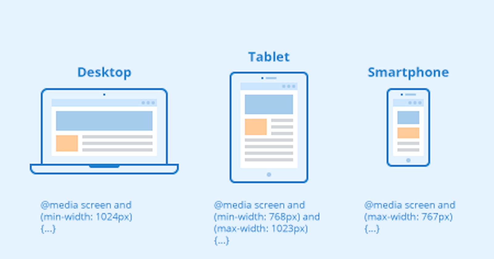
Different Devices Screen Sizes :
/* Extra small devices (phones, 600px and down) */
@media only screen and (max-width: 600px) {...}

/* Small devices (portrait tablets and large phones, 600px and up) */
@media only screen and (min-width: 600px) {...}

/* Medium devices (landscape tablets, 768px and up) */
@media only screen and (min-width: 768px) {...}

/* Large devices (laptops/desktops, 992px and up) */
@media only screen and (min-width: 992px) {...}

/* Extra large devices (large laptops and desktops, 1200px and up) */
@media only screen and (min-width: 1200px) {...}
That's all hope you enjoyed!